iPhone App Update
First posted on TheBenchNews by Ben our guru developer
I have been hard at work over the off season giving the iOS App a bit of a face-lift (actually it is more than a facelift, it has been a complete re-write of every single line of the code, but lets not let details get in the way of a good story).
You might be familiar with how the App works but it all looks a bit different so I thought I would take you through it and introduce you to some of the new features.
 Look and Feel
The first thing you will notice is the look and feel.
The whole thing has been updated to be more iOS 8’ish (if that is a word), ie. updated to align closer with the new look-and-feel introduced by Apple in recent releases.
Clean lines, nice fonts and automatically resizing of the user interface so the app will look good on any size iPhone from the original screen size of iPhone 3 and 4, the longer form of the iPhone 5 and the new bigger iPhone 6 and 6 Plus.
Widget
One of my favourite features of the recent Apple IOS updates is Widgets.
A Widget is one of the handy little panels that you can access from anywhere by just pulling your finger down from the top of the screen to reviews the “Today” page. It means you don’t need to open the whole App (and close what you are doing) to access some quick info.
Well the good news is now TheBench has a widget! Yeee harr!
When you first load the App, open the “Today” page on your phone by dragging it down from the top. At the bottom of the page, you will see an edit link when you can customise which widgets you see. Click edit and you should find some options to add the TheBench widget to the “Today” page so you can get super quick updates to the scores as things progress through the weekend.
Beauty!
 The Draft
We have previously never supported any draft functionality on the iOS app so I thought it was time we did something about it… so I did.
The app now not only lets you add and remove players from your squad during the season (see the Squad section below), but also lets you do it during the draft.
The bad news is that you now no-longer have any excuse for holding up your draft.
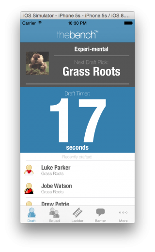
The biggest change you will see is the new Draft Tracker page which will load in place of the Home page when the draft is running. The Draft Tracker page lets you see who has the next pick and also gives you a running account of who has recently been picked.
Front and centre on the screen is a timer which will either count up, if you have no time limit, or down if you do have a time limit set on draft picks. This tab is a great little heads up display to sit on the table during a live draft.
Picking a Team
Picking a team is not all that different to previous versions of the app other than a lick of paint. If you support a bonus position like Captain or Kicker, you will see the option at the top of the list. You can also Sort the list by the players average score for a positions. As on the Website, your Competition Manager can edit which Positions are used for the sorting.
Squads
The Squad page has been rebuilt to add a couple of features that have been asked for on our Feature Request page (which is here by the way: https://thebench.com.au/feature-requests), specifically the ability to add you your squad and the ability to drop players.
Firstly, dropping players is now as easy as, well, a swipe of your finger. As is common on iOS Apps, simply swipe your finger from right to left across the player you want to drop and the “Delete” option will be reviled. Simply touch the Delete button to drop the Player from your Squad.
With a Player deleted, you can now also add players to your Squad by touching on the + at the top right of the screen. This will take you to the Add Player page from where you can search for and add players to your squad.
The best news is, as mentioned above, this functionality also works during draft so you can now make your draft picks on the run.


Home Page & Ladder
I have given the home page a touch-up or two as well. Functionally is largely the same as you have seen in previous years but it is now better.
You can click on any of the games to view the head-to-head page to see exactly who your opponent has picked in their team and who is scoring all the points.
An then there is the ladder… not much to say about the ladder… still there…
So that’s about it as a very quick walk through. A few new key features, a lick of paint and you should find better performance and stability all around.
As always, if you have any suggestions, I would love to hear them so post them up on our suggestions page here: https://thebench.com.au/feature-requests
JB
Latest posts by JB (see all)
- 2022 NRLCEO Position Updates - August 24, 2022
- NRLCEO HQ – No Pride in Manly (Ep #273) - July 27, 2022
- NRLCEO T-Shirt Competition - May 10, 2022


